
We can set multiple css properties to create animation border over image using css. We can set the transitions for width, height, background-color, transform. Hover over the image to see the animation with a period of time with changes take effect immediatly.
Example:
<html lang="en">
<head>
    <meta charset="UTF-8">
    <title>Animated borderover image using css</title>
    <style type="text/css">
        .box {
            border-width: 1px;
            display: block;
            width: 0px;
            height: 79px;
            transition: width 2s, height 2s, background-color 2s, transform 2s;
        }
            .box:hover {
                width: 338px;
                height: 79px;
                -webkit-transform: translate(180deg);
                transform: translate(180deg);
                border-style: solid;
            }
    </style>
 </head>
<body style="border: 1px solid #DED8D8; width: 500px;height:250px">
    <h2 style="color: #00BCD4;">Animated border over image usingcss</h2>
    <p>hover over the logo image to seeanimated border.</p>
    <div class="box">
         <img src="http://www.infinetsoft.com/Images/logoinfi.png" alt="logo">
    </div>
</body>
</html>
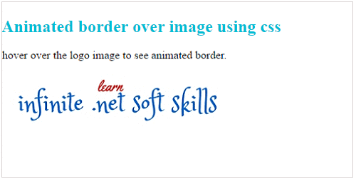
Output:
Post your comments / questions
Recent Article
- How to create custom 404 error page in Django?
- Requested setting INSTALLED_APPS, but settings are not configured. You must either define..
- ValueError:All arrays must be of the same length - Python
- Check hostname requires server hostname - SOLVED
- How to restrict access to the page Access only for logged user in Django
- Migration admin.0001_initial is applied before its dependency admin.0001_initial on database default
- Add or change a related_name argument to the definition for 'auth.User.groups' or 'DriverUser.groups'. -Django ERROR
- Addition of two numbers in django python
Related Article