
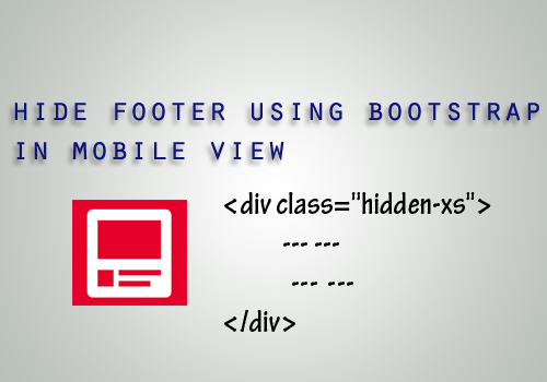
In this article I will show how to hide responsive footer in bootstrap mobile view. It is simple; you can create a div tag and apply the following Css footer code hidden-xs. Paste the footer coding inside the created div tag.
When you apply “hidden-xs” class; it will hide the elements on the extra small devices which having a screen width less than 768px. Visible on other device screen length greater than 768px.
HTML footer Code:
<div class="hidden-xs">
<footer>
<div class="content-wrapperfootr">
<ul style="float: right;">
<li><a href="/">Home</a></li>
<li><a href="Profile">Profile</a></li>
<li><a href="STK">Our Products</a></li>
<li><a href="Contact">Contact</a></li>
<p>© @DateTime.Now.Year - example.com</p>
</ul>
<a href="http://www.infinetsoft.com/">DESIGNED by infinetsoft</a>
</div>
</footer> </div>
Post your comments / questions
Recent Article
- How to create custom 404 error page in Django?
- Requested setting INSTALLED_APPS, but settings are not configured. You must either define..
- ValueError:All arrays must be of the same length - Python
- Check hostname requires server hostname - SOLVED
- How to restrict access to the page Access only for logged user in Django
- Migration admin.0001_initial is applied before its dependency admin.0001_initial on database default
- Add or change a related_name argument to the definition for 'auth.User.groups' or 'DriverUser.groups'. -Django ERROR
- Addition of two numbers in django python
Related Article