
Provides a border for the element, with a width equal to 1 local device pixel, which can be very sharp and clear.
HTML CODE:
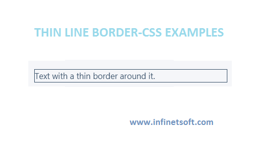
<div class="hairline-border">
    text with a thin border around it.
</div>
CSS CODE:
.hairline-border {
    box-shadow: 0 0 0 1px;
}
 @media (min-resolution: 2dppx) {
    .hairline-border {
        box-shadow: 0 0 0 0.5px;
    }
}
 @media (min-resolution: 3dppx) {
    .hairline-border {
        box-shadow: 0 0 0 0.33333333px;
    }
}
@media (min-resolution: 4dppx) {
    .hairline-border {
        box-shadow: 0 0 0 0.25px;
    }
}
Description
- box-shadow , when using only extensions, add a fake border that can use subpixels*.
- Use @media (min-resolution: ...) To check the device pixel ratio ( 1dppx equal to 96 DPI), set box-shadow the distribution to 1 / dppx. .
Post your comments / questions
Recent Article
- How to create custom 404 error page in Django?
- Requested setting INSTALLED_APPS, but settings are not configured. You must either define..
- ValueError:All arrays must be of the same length - Python
- Check hostname requires server hostname - SOLVED
- How to restrict access to the page Access only for logged user in Django
- Migration admin.0001_initial is applied before its dependency admin.0001_initial on database default
- Add or change a related_name argument to the definition for 'auth.User.groups' or 'DriverUser.groups'. -Django ERROR
- Addition of two numbers in django python
Related Article